As an Amazon Associate, we earn from qualifying purchases. Some links on this site are affiliate links at no extra cost to you. Our recommendations are based on thorough research and editorial judgment.


Color Psychology in Outdoor Spaces: Choosing Shade Sail Colors

Color choices shape outdoor mood and function. Warm hues like red or orange boost energy for social zones, cool blues and greens promote calm for relaxation, and neutrals blend with landscaping. Dark fabrics absorb heat and reduce glare, light fabrics reflect sunlight lowering temperature by about 5–8°C, and UPF 30–50+ fabrics block most UV; HDPE sails can reach 95% UV reduction. Follow 60/30/10 colour balance, test swatches in place, and continue for installation, maintenance, and climate tips.
Key Takeaways
- Warm colors (reds, oranges) increase energy and sociability, ideal for dining and entertaining zones.
- Cool colors (blues, greens) promote calm and relaxation, suited for lounges and meditation areas.
- Light colors reflect heat, lowering under-sail temperatures by about 5–8°C, beneficial in hot climates.
- Dark colors absorb UV and reduce glare, improving privacy and perceived shade depth but can feel warmer.
- Choose UV-stabilized HDPE with UPF 30–50+, test swatches on-site, and balance dominant, secondary, and accent colors.
How Colour Influences Mood and Behaviour Outdoors
You may be interested

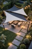
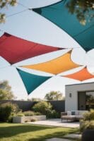
A few intentional color choices can change how people behave in an outdoor area. Warm colors, like red or orange, stimulate energy and suit social zones, for example a 4.5 x 3 m shade sails installation above a patio. Cool blues and greens create tranquil environments, offering relaxation and serenity near pools or reading nooks, recommended fabric with 80–95% UV block. Neutral colors enhance elegance and blend with landscaping, useful for 3 m high pergolas and mixed-material decks. The psychological impact of color guides choosing colors based on intended use, time of day, and seasonal shifts. Rotating shade sails seasonally can transform your outdoor mood while maintaining UPF ratings, and simple tests, like fabric swatches in sunlight, come to the rescue. For those concerned with durability, heavy-duty materials like virgin HDPE used in many shade sails offer resilience against harsh sunlight and longevity.
The Science of UV Protection: Colour, UPF and Shade Factor
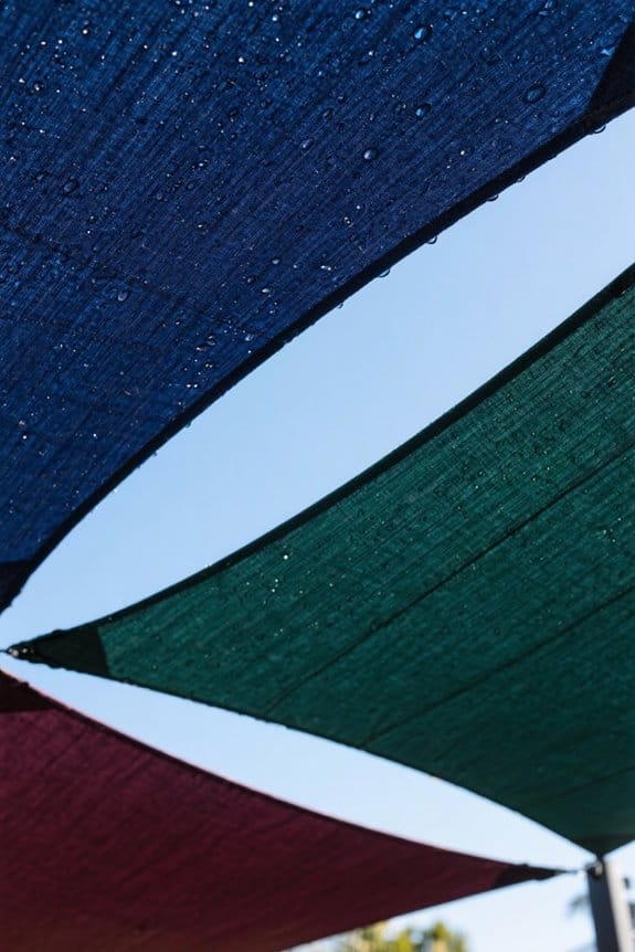
Sun protection depends on more than fabric weight and weave. Darker colors generally provide higher UV protection because they absorb more light and convert it into heat, improving shielding against UV rays. UPF (Ultraviolet Protection Factor) rates fabrics numerically, from 15 (good) to 50 (excellent) per ARPANSA standards. Shade Factor measures absorption across 290–770 nm, so a higher Shade Factor means less visible and invisible light passes through. A shade sail can show high UPF yet lower Shade Factor, so choosing colors requires balancing both metrics for effective outdoor shade. Lighter colors, like yellow or sky blue, suit already shaded spots, often yielding lower UPF. Use UPF labels and Shade Factor data when choosing colors. Many shade sails, like those made from high-density polyethylene, block up to 95% of harmful UV rays, ensuring both protection and comfort in outdoor spaces.
Recommended Products

【𝗦𝗨𝗣𝗘𝗥 𝗛𝗘𝗔𝗩𝗬 𝗗𝗨𝗧𝗬 𝗡𝗘𝗪 𝗣𝗔𝗧𝗘𝗡𝗧 𝗗𝗘𝗦𝗜𝗚𝗡】: Made of 260 GSM permeable extra heavy duty fabric, heavy duty stainless mounting rings, cable wires built-in edges, integrate into the mounting rings, all pulling strength goes to the cable wires, not only making the edges more durable, it also enhence the appearance of shade sail.

【𝗦𝗨𝗣𝗘𝗥 𝗛𝗘𝗔𝗩𝗬 𝗗𝗨𝗧𝗬 𝗡𝗘𝗪 𝗣𝗔𝗧𝗘𝗡𝗧 𝗗𝗘𝗦𝗜𝗚𝗡】: Made of 260 GSM permeable extra heavy duty fabric, heavy duty stainless mounting rings, cable wires built-in edges, integrate into the mounting rings, all pulling strength goes to the cable wires, not only making the edges more durable, it also enhence the appearance of shade sail.

☀Highlight: Patent pending design Light Pop-Up Screen Room for 12-15 adults, 26.5 lbs, innovated frame and folding way keep compact carry bag with 44.8” diameter. Pop Up automatic, no assembly need, stable and durable, easy folding and carry around. Alvantor screen house frame is made of fiberglass, light-weight and long-last, other similar tents on the market are made of steel and iron, which is heavy and easy to be rusted.
Choosing Between Light and Dark Shade Sails
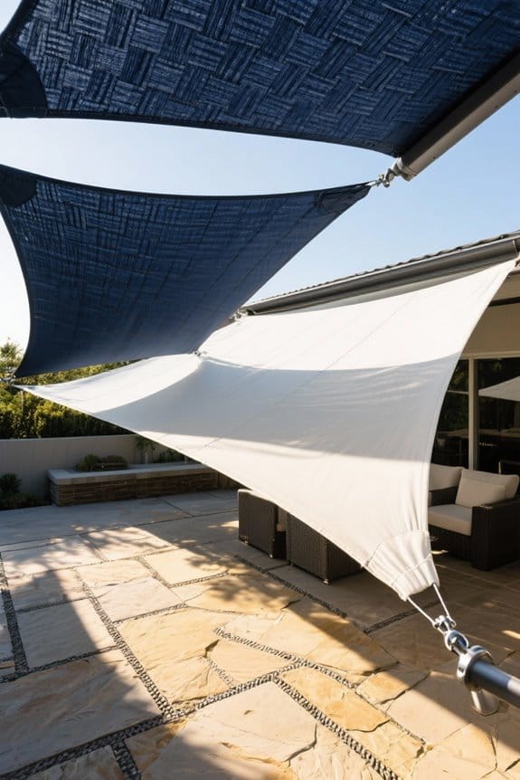
When deciding between light and dark shade sails, homeowners should weigh temperature control and visual comfort together. Light shade sails, like beige or ivory, reflect sunlight and lower temperatures beneath by up to 5–8°C, useful for patios and pool decks. Darker shades absorb heat, reduce glare, and increase perceived depth of shade, often blocking 10–20% more visible light than light fabrics. For comfort and style balance, select UV-stabilised fabrics rated UPF 30–50+, with mesh density 200–400 g/m² to match local solar intensity. In hot climates, prioritize light tones and reflective surfaces, which come to the rescue for heat management. For privacy or theatre-like darkness in an outdoor area, choose charcoal or navy, and guarantee the shade structure has adequate ventilation. Additionally, consider HDPE fabrics with reinforced seams for enhanced durability and resistance to wind damage.
Recommended Products

Premium Material: Our sun shade sail is made of 260 GSM high density polyethylene fabric. The fabric design effectively blocks direct sunlight and UV rays, while its breathable properties promote air circulation, enhancing comfort in outdoor environments.

HIGH QUALITY MATERIAL - Our rectangle sun shade sail is made of 260GSM high-density polyethylene, finished with the strong stitching seam and double webbing. It is durable and fade-resistant, but not waterproof.

New Design: "A" corner head design for maximun pulling strength Unique Strengthen A-Ring & Advanced steel wire reinforced string, The string is made of high quality metal, perfect to support large size sun shade sail.
Colour Schemes: Matching, Monochrome and Contrasting Options
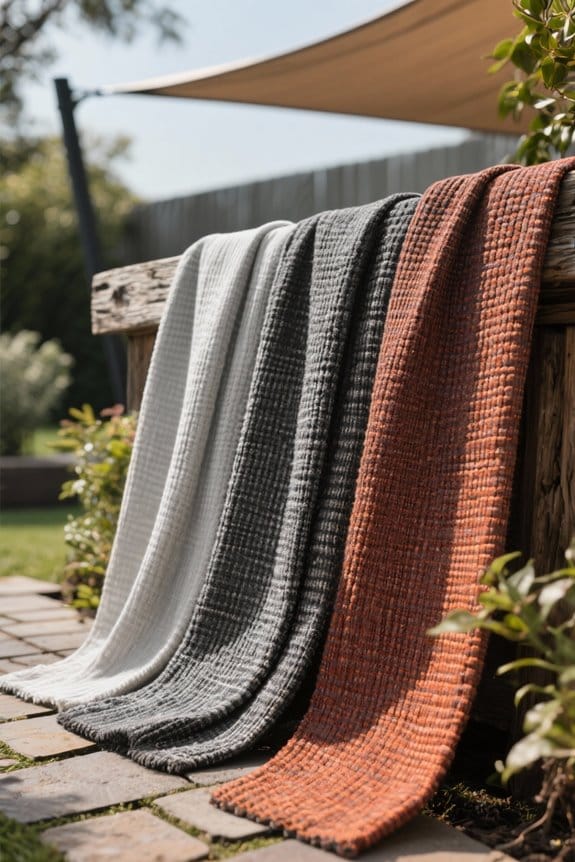
Although colour choices often seem purely decorative, they directly affect perceived temperature, privacy, and cohesion in outdoor areas. Matching colour schemes work well for harmony, using analogous or monochrome palettes that vary by 10–30% in saturation and value for subtle depth. Complementary colour schemes create contrast, pairing opposing hues from the colour wheel for up to 180° separation to boost visibility or branding. Warm colours like terracotta or sunflower energise spaces, while cool colours such as teal or slate promote calm; choose based on function. Effective colour combinations balance a dominant shade (60%), secondary (30%), and accent (10%) to remain visually appealing. For practical planning, test 1 m² fabric swatches in situ, observe at midday and dusk before final selection. When considering shade sails, ensure proper measurement between D-ring to D-ring for accurate fitting to enhance the aesthetic appeal and functionality.
Recommended Products

𝗖𝗢𝗟𝗢𝗥 & 𝗦𝗜𝗭𝗘: Classic Series Features a Gray Frame, Fabric Color: Canvas Umber (solid), Size: 13' Wide x 10' Projection Full Extension. Advaning Awnings are 100% Fully Pre-Assembled and Ready for Installation.

【𝗛𝗘𝗔𝗩𝗬 𝗗𝗨𝗧𝗬】: our super ring shade sail exact 260 GSM permeable extra fabric, stainless mounting super rings, edges with cable wires built-in, integrate into the mounting rings, all pulling strength goes to the cable wires, making the edges more durable

HIGH QUALITY MATERIAL - Our rectangle sun shade sail is made of 260GSM high-density polyethylene, finished with the strong stitching seam and double webbing. It is durable and fade-resistant, but not waterproof.
Fabric, Structure and Colour: Practical Considerations
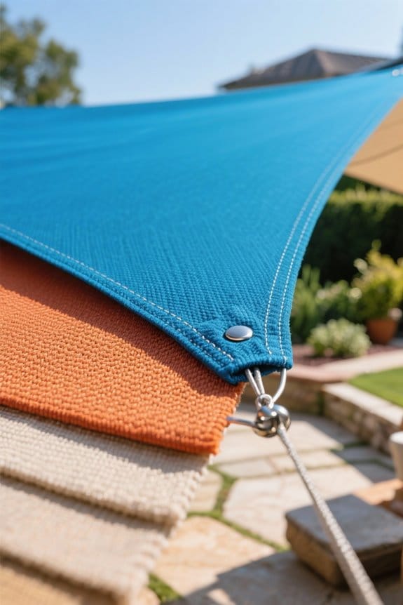
Because fabric, structure and colour interact to determine performance, decisions should consider both technical specs and visual fit. Choose fabrics rated 80–95% UV protection, listed by UPF (ultraviolet protection factor), to guarantee effective shade and longevity. Match shade sails to structural elements, like timber posts or steel frames, for coherent colors and improved aesthetic appeal. Waterproof canopies come in RAL or Pantone ranges; align these with fabric swatches. Note that darker colours often offer higher UV protection, converting light into heat, and can hide dirt, reducing maintenance frequency. Lighter tones need cleaning every 3–6 months in dusty areas. Check tensile strength (kN/m), fabric weight (g/m²), and seam construction before ordering. Use samples on-site to confirm colour and fit. Consider sails that block 95-98% of UV rays to ensure maximum sun protection for your outdoor spaces.
Recommended Products

HIGH QUALITY MATERIAL - Our rectangle sun shade sail is made of 260GSM high-density polyethylene, finished with the strong stitching seam and double webbing. It is durable and fade-resistant, but not waterproof.

Commercial Grade Quality: Uv-protected high-density polyethylene, 100% virgin material. Shade fabric with strong stitched seam and durable stainless steel A-rings in each corner and cable wires built-in edges. Integrate into the mounting rings, all pulling strength goes to the cable wires, making the edges more durable.

▲Durable material: the shade net is made of high-density polyethylene material (HDPE), which is healthy and environmentally friendly, odourless, anti-ageing, soft, foldable, easy to carry and store, knitted construction, tear-resistant and durable.
Colour and Heat Management for Different Climates
Having covered fabric, structure and colour interactions, practical choices now move to how colour affects heat under the sail. Light colors such as beige and ivory reflect sunlight, keeping outdoor spaces cooler, typically lowering surface temperatures by 5–10°C compared with darker fabrics. Darker sails like navy or charcoal absorb heat, useful in cool climates to raise perceived warmth by 2–6°C. In very sunny regions, choosing the right color means selecting light colors for patios, playgrounds, and pool decks to minimize heat accumulation. Combine light-colored shade sail colors with reflective materials, such as aluminized coatings or 30–60% reflective backings, to maximize cooling. For mixed climates, use modular sails—light for summer, darker for changing months—to balance comfort and effective heat management. To ensure durability against weather conditions, it’s important to select waterproof materials like PU-coated HDPE or durable polyester, which also help in providing UV protection and resistance to light rain.
Branding and Commercial Applications of Shade Sail Colour
Many businesses choose shade sail colours to reinforce brand identity and guide customer behavior. Designers recommend matching primary brand hues at a 60/30/10 ratio, with 60% neutral shade, 30% dominant brand colour, 10% accent to create contrast. A sail can be 3–6 m per side, custom-cut to fit patios or courtyards. In commercial settings, colour psychology informs choices: blue tones calm, red tones energize, yellow invites cheerfulness. Brewdog in Brisbane is an example of bespoke colour use creating an inviting ambiance and strong visual recall. Complementary schemes produce striking contrast, increasing visibility from 20–50 m. Practical specs include UV-stable fabrics rated UPF 50+, 300–500 g/m2 tensile strength, and fade-resistant pigments to guarantee branding longevity without losing intended ambiance. When selecting shade sails, consider the durability and quality of materials like HDPE to ensure long-lasting use.
Recommended Products

Premium Material: Our sun shade sail is made of 260 GSM high density polyethylene fabric. The fabric design effectively blocks direct sunlight and UV rays, while its breathable properties promote air circulation, enhancing comfort in outdoor environments.

Super Heavy-Duty Commercial Grade Design: Crafted from 280GSM extra-heavy-duty permeable fabric and reinforced with stainless steel mounting rings. The patented Artpuch design integrates steel cables into the edges, directing all pulling tension to the cables—enhancing both durability and appearance for commercial and residential use.

Commercial Grade Quality: Uv-protected high-density polyethylene, 100% virgin material. Shade fabric with strong stitched seam and durable stainless steel A-rings in each corner and cable wires built-in edges. Integrate into the mounting rings, all pulling strength goes to the cable wires, making the edges more durable.
Maintenance, Longevity and Fading: What to Expect
After choosing colours to match a brand palette, owners must plan for how shade sails will age in sun and weather. Darker fabrics resist UV breakdown longer, often extending lifespan by 20–30% compared with pale tones, which show fading sooner. Use UV-stabilized HDPE (high-density polyethylene) to improve durability and slow color loss. Perform maintenance every 3–6 months, inspect seams, and clean with mild soap and a soft brush to prevent grime-related degradation. Expect gradual fading over 3–8 years depending on exposure; heavy sun (5–7 hours daily) accelerates UV breakdown. Replace sails when structural strength drops below 70% or when aesthetic fading reduces outdoor comfort. Document fabric specs, including UV ratings and tensile strength, to guide future purchases. When choosing a shade sail, consider high-density polyethylene as it provides both durability and effective UV protection.
Frequently Asked Questions
Does the Color of a Shade Sail Matter?
Yes; the color of a shade sail matters. It affects color meanings and emotional impact, shapes outdoor ambiance and aesthetic appeal, responds to sun exposure and environmental influence, and can reflect cultural preferences.
What Color Should a Sunshade Be?
A practical choice is a mid-tone neutral; like a compass, it balances sunshade aesthetics and color temperature—optimizing outdoor ambiance, energy absorption, mood enhancement, UV protection, and aligning with color trends for cohesive, long-lasting spaces.
How to Choose the Right Shade Sail?
Choose by evaluating design considerations, sunlight exposure, fabric durability, and personal preference; weigh environmental impact and artistic expression; seek professional installation tips, measured fittings, sturdy fittings, and maintenance plans for a functional, aesthetic, long-lasting shade sail.
What Is the Best Color for Sails?
The best color for sails depends on purpose: neutral tones and light shades cool and blend, dark colors provide privacy and durability, cool hues soothe, warm shades energize; bright colors add vibrancy, adjusted for seasonal variations and site needs.


